ABCs &123s – Glyph Composition

Both Compositions for Project 1 Art 230
For this project we were instructed to use only black, white and only alphanumeric glyphs. In the end we were two have two separate designs one comprised of the Sans-Serif font : Neue Haas Grotesque Bold, and a Serif Font Stemple Garamond Roman. There were several guides, for example we could had to have between five and eight different glyphs, we had to identify five different elements of typographic anatomy, and we had to include two white and two black glyphs with no outlines. Below are my final designs. Please enjoy.
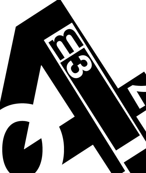
Neue Haas Grotesque Bold
This is my Sans-Serif design containing seven black and white glyphs. The main character is my bold black four. Inside my four I embedded a white lowercase l and inside of the l, I turned an i upside down ad contrasted it by making it black. I also added a black m and a white 3. Also in this design I added a white 7 and a large white uppercase O. There is lots of contrast and also the four gets lost behind the O and is found again. I found it more challenging to work with a Sans-Serif font, which was odd I thought it would have been easier due to the simplicity of it’s form. I also found it difficult because the letters are solid, and we had to keep them that way. With shapes we can alter shapes, but to alter a glyph would be terrible, because you would be taking away it’s character. I feel my design is solid and I feel I have Neue Haas Grotesque to thank for that.
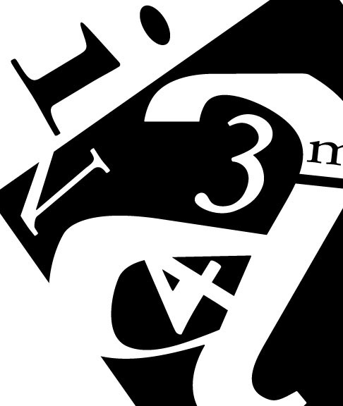
Stemple Garamound Roman.
In this design I tried to think out of the box. I used the required Stemple Garamound Roman. I chose a black canvas. I then rotated the canvas and in the remaining white space I added a black lower case i. Other letters include a lower case a, the numbers 3 and 4, and a N in white. In black I added a lower case m and a lower case l. I love the lower case a, it has a unique appearance that carries my eyes through the whole design. I feel the serifs add to my design. I also thought it was interesting in the Sans-Serif the tittle is square, and in my Serif design my tittle is round. Each font portrays a certain uniqueness I hope I captured.

