Akira Kobayashi – Font Poster
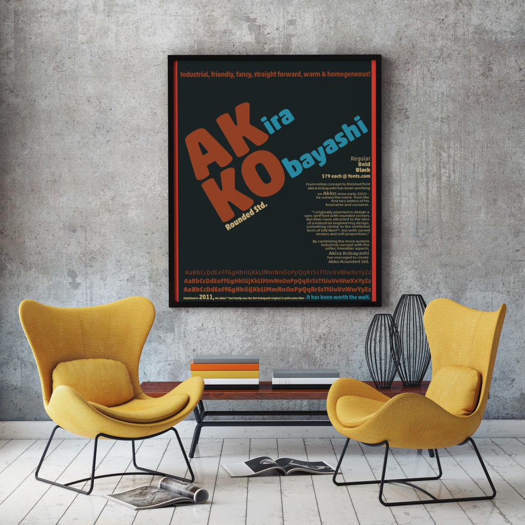
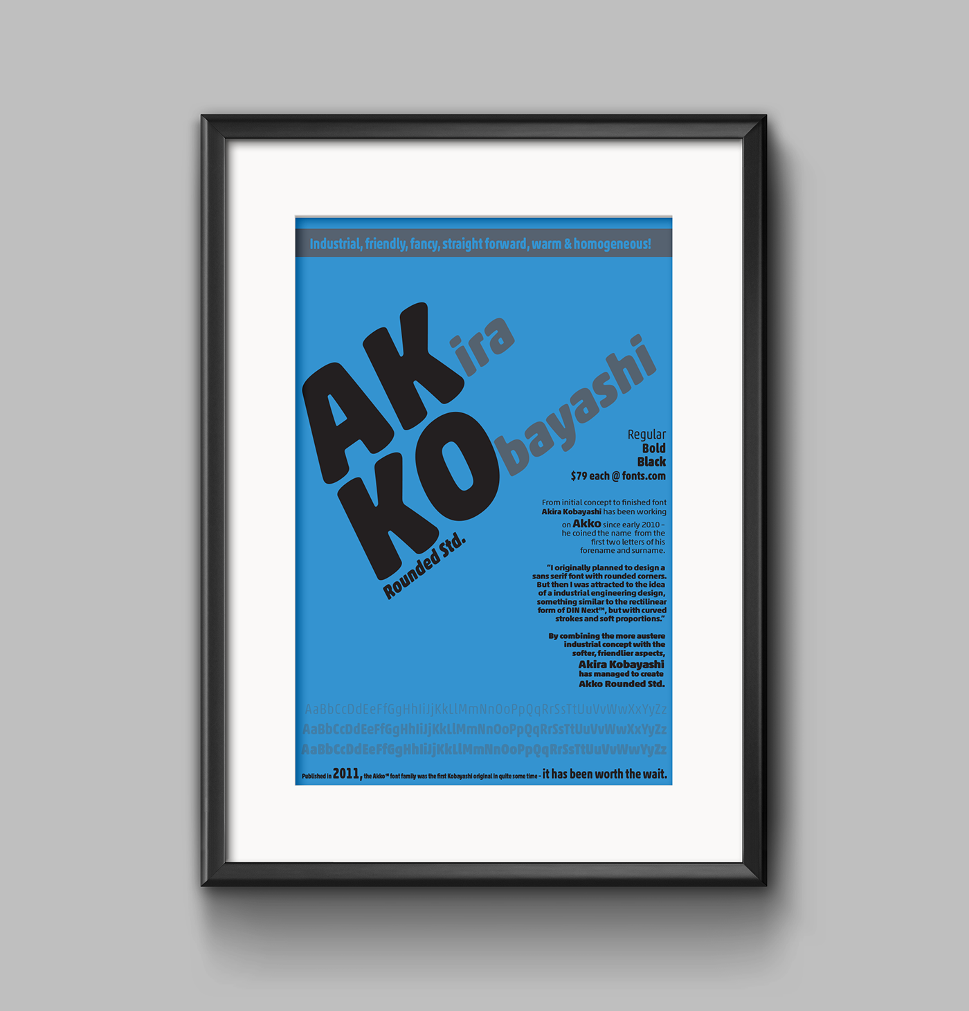
For this assignment we were asked to design an advertising poster for a specific font determined by our professor. I was given Akko. This to me was a very challenging project. For one we couldn’t choose the font, (which was probably a blessing, because I sometimes have a hard time settling on a decision, so this perk did save me a lot of agonizing time), and second for all the information we needed to include while still having a appealing design.
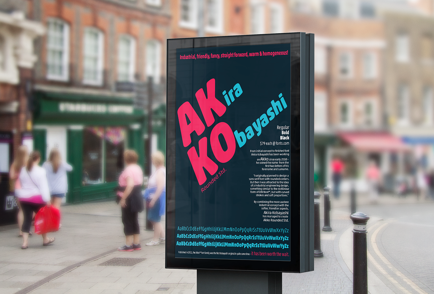
We had to include of course the font name, and then we needed the designer, some history, variations of the different styles available, the price and where the font may be purchased.
My classmates and I started with hand drawn sketches, then digital. Of all of our sketches we eventually narrowed it down to one and then began adding color. This always scares me at first. I am okay with black and white. I am not 100% sure why color intimidates me. I love color. I think maybe there are so many incredible choices to choose from maybe it is overwhelming. I am not sure. On thing I am sure of is that once I start I can not stop.

Akira Kobayashi was looking for an industrial engineer feel. I researched industrial engineer logos, and used them as my palette. I also tried to keep the colors – “..friendly, fancy, straight forward, warm & homogeneous!”
Once we were finished we were to choose one for our final.
I hope you like it.

Until next time,
Erin
P.S. Confession. I was having a hard time choosing a color so I posted my posters on my facebook feed. All my colors received pretty even feedback. So I had to pick. However, my mom liked the blue so, this one is for you mom.
